Your Product and Your Website Are Describing Two Different Companies
Time-to-Trust
•
Framework
•
14
min read

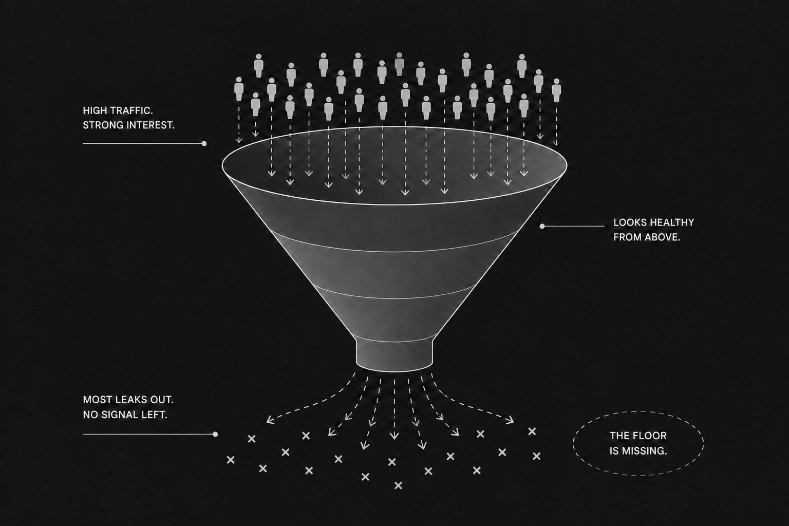
The business is working. Revenue is coming in. The team knows what it is doing. Referrals are decent.
But something about growth feels stuck. Deals take longer than they should. The wrong leads keep showing up. Conversion is worse than the quality of the product actually explains. Churn happens in places that do not make sense internally.
Most founders run this through two possible diagnoses. The product needs more features. Or the marketing needs to be louder. Both answers are usually wrong.
What is actually broken is the relationship between what the company built and what its website says it built. When those two things pull in different directions, the business starts paying a quiet tax. It shows up in longer sales cycles, confused prospects, misaligned onboarding, and churn that keeps getting blamed on the wrong department.
Most founders do not track this gap because it does not live on a dashboard. It accumulates in the form of qualified buyers who made a private decision and never announced it. It shows up as a ceiling on growth that nobody can fully explain, because the data that would explain it sits in conversations that never happened.
This is not a design issue. It is a signal architecture failure.

The homepage describes a broader version of the company than what the product actually delivers
The product has real depth the website never demonstrates, shows, or makes visible to a first-time evaluator
The marketing attracts a type of buyer the product was not built to retain
The homepage promises outcomes the first thirty days of onboarding will contradict
The proof section shows polished testimonials without enough of the situation that preceded them
The internal team describes the product differently in every sales call because the website never gave them a stable version to work from
The digital presence has not been updated to reflect what the product has become in the last two to three quarters
Each of these increases evaluation friction.
Buyers use the digital presence as a proxy for the product before they ever see the product. When the two feel different, buyers cannot articulate the discomfort but they act on it immediately, and they act quietly.
A website that overpromises fills the pipeline with people the product was never going to retain. Every churn cycle that follows gets blamed on product quality when the real failure happened upstream, in the way the business described itself to the market.
A website that underpromises bleeds the company silently. Qualified buyers arrive, cannot see the depth of what the product actually does, and leave for a competitor with a cleaner message. This loss never enters the CRM because the buyer never made contact.
The product team and the marketing team are evaluated on different metrics. The product ships improvements quarterly. The website stays behind. Neither team notices the divergence because neither is looking at the same number.
By the time a buyer reaches a sales conversation, they have already formed a private conclusion based on what the digital presence communicated. If that conclusion was built on a false or incomplete signal, the sales call becomes a correction exercise. Most buyers do not stay for that correction.
Time-to-Trust increases. High-value buyers leave before confidence forms.

The product-presence mismatch does not run in one direction. It breaks in three distinct ways, each with a different surface symptom, a different root cause, and a different type of financial damage attached to it.
The Value Gap: A Product Better Than Anything the Website Suggests
This is the most common version, and the one most founders never fully recognize because the business still technically works.
Revenue arrives. Referrals come in. The team is producing real results for the clients it has. But growth has a ceiling that does not correspond to the quality of what is being built. Deals take longer than they should. Sales conversations require too much education before a qualified buyer can feel confident. Prospects who should have been obvious closes need multiple follow-ups to rebuild a case the website should have already made for them.
The product team built something real. The marketing layer never caught up to it.
This shows up in a predictable set of patterns. The homepage headline describes a broad category instead of a specific mechanism. The copy uses language that could belong to any competitor in the space with the brand name swapped out and nobody would notice. The proof section has testimonials that say "great team, highly recommend" rather than testimonials that say "here is the specific situation we were in, here is what changed, and here is what it measured to." Case studies exist but they are written so carefully around legal or confidentiality concerns that the actual result gets diluted into nothing. Product screenshots are absent or show a version from two major releases ago. The real depth of the product, what it actually does that alternatives do not, is only visible after a demo has been requested and attended.
The product is strong enough to carry the business through referral networks and tight communities where word of mouth substitutes for clear positioning. But it is also carrying a quiet cost. Every buyer who hits the digital presence and reads it as amateurish or generic makes a private decision that never shows up as a lost deal because they never entered the pipeline to begin with.
There is a pattern that surfaces regularly in SaaS communities: a founder openly describing their website as terrible while the product drives meaningful demo volume week after week. The product-market fit is strong enough that buyers push through the friction. The invisible metric, the one that never shows up on the growth chart, is the number of more cautious, higher-value buyers who hit that same website, read it as a low-quality signal, and moved on to a competitor whose digital presence made the product feel professionally grounded.
The product is carrying the business. The website is taxing it.
There is also an internal version of this that rarely gets discussed but compounds the problem significantly. When the website cannot articulate what the product does at depth, the sales team fills the gap themselves. Every sales rep develops a slightly different version of the pitch. The product gets described in five slightly different ways across five different conversations. The company starts sounding inconsistent not because the team is inconsistent but because the anchor, the website, never gave them a stable version to work from.
This is where the CEO who believes the company is "innovative" and the customer who says it is "confusing and outdated" exist at the same time. It is not always a product problem. It is an alignment problem. The internal team has one version of the company in their head. The digital presence communicates a different version. The buyer experiences a third version in the sales call. None of these are the same company.
The Value Gap is not a website problem in isolation. It is a positioning problem that the website makes permanent. What the company built is more valuable than anything the typical buyer can see from the outside. Every day that gap persists, the business is leaving qualified pipeline in places where it will never be measured or recovered.

The Trust Trap: A Website Selling What the Product Has Not Yet Earned
This is the version that looks like success for the first three to six months and then becomes a crisis the company does not know how to diagnose.
The digital presence is professional. The branding is specific and clean. The copy is persuasive and clear. The website converts at a rate that feels like proof of product-market fit. Demos are being booked. Trials are starting. MRR is moving in the right direction. The company looks like it is breaking through.
Then the churn starts.
The team adds features. Redesigns onboarding. Changes the pricing model. Rebuilds the dashboard. Runs the same experiment across five different configurations. The churn rate does not materially move.
The mistake being made is treating this as a product problem. The team is looking for the leak inside the product experience. The leak is not there. It is upstream, in the digital presence, in the gap between what the website communicated and what the product can actually deliver.
The website attracted the right volume of buyers but the wrong profile of buyers. The positioning was broad enough to pull in users who were not actually a strong fit for what the product does in its current state. The homepage promised a simplicity, speed, or scale the product achieves under specific conditions but cannot deliver universally. The hero section spoke to an aspiration rather than a mechanism. The case studies showed best-case outcomes without the context that made those outcomes possible for that specific type of buyer. The testimonials said "changed our workflow" without explaining the workflow, the company size, or the situation.
The product did not fail those users. The marketing created expectations the product was never designed to meet.
The financial shape of this plays out in a way that is well-documented among founders who have been through it. The company looks at twelve percent monthly churn. It tries everything: new features, redesigned onboarding, improved UX, different pricing, expanded customer support. Nothing sustains improvement because the intervention is at the wrong level. When the actual churned users are examined closely, the consistent finding is not that the product was bad for them. It is that they arrived with an expectation the website built that the product was never going to meet. They interpreted the value proposition in a way the product could not fulfil. They signed up based on what the marketing said. They left when the product told them the truth.
The fix in that situation is not a product sprint. It is a narrowing of the digital presence to speak precisely to the buyer the product actually serves well. When that happens, signups often drop sharply. MRR can grow simultaneously. Not because the product changed but because the pipeline stopped filling with people the product was never going to retain past the first billing cycle.
That is the Trust Trap. It does not feel like a trap from the inside because it looks like demand. It is demand built on a description the product cannot sustain. And unsustainable descriptions always surface eventually.
There is also an organizational cost that rarely gets fully priced in. Customer success teams burn their capacity managing churn that cannot be resolved from inside the product. The product team adds features in direct response to feedback from churned users who were never the right buyer to begin with. The sales team gets better and better at closing people who will not stay. Everyone in the company is working harder to maintain a number that the digital presence is actively undermining from the top of the funnel.
The harder version of this to say plainly: the better a website is at converting unqualified buyers, the faster a company reaches its churn ceiling. More polish on a misaligned message is not an asset. It is an accelerant for the wrong direction. The ceiling will arrive regardless. The only variable is how much capital and team capacity the company has spent trying to fix from inside what was broken from outside.
The Classic Double-Failure: Neither Side Is Working
This is the clearest version to identify and the hardest to fix, because fixing the presentation does not address the underlying problem.
The product is not meaningfully different from what already exists in the category. The website does not do anything useful for the buyer who lands on it. There is no referral network creating enough pressure to compensate for the absence of either. There is no segment of the market where the product has developed genuine depth. The company is competing in a space where reasonable alternatives exist and where the digital presence offers no clear reason for a buyer to choose it over anything else already visible.
Every channel the company tries hits the same ceiling. Traffic shows up. Nothing converts. And when it does convert, it does not retain.
The instinct is to treat this as a marketing problem. The website gets redesigned. The copy gets rewritten. The ads get rebuilt. The results do not durably improve because everything being redesigned is the wrapper around a product that has not yet found its specific reason to be chosen over alternatives.
No amount of visual refinement, conversion rate optimization, or cleaner copy can substitute for a product that has earned a clear and specific place in the buyer's decision set. A new website cannot create urgency the product has not earned. A better headline cannot manufacture differentiation that does not exist in the product experience itself.
There is a version of this that shows up in early-stage product development where founders copy the homepage structure, the design aesthetic, and the copy architecture of a category leader without understanding the strategic foundation underneath it. The digital presence looks polished because it borrows from something that works. But it borrows the surface without the position. The design says one thing. The product delivers something else. The buyer who arrives expecting the category leader experience and encounters something that only looks like it gets confused at the point where the resemblance ends.
A redesign cannot compensate for an undifferentiated product. A better ad cannot create urgency around something the market does not feel acute pressure around. A cleaner pricing page cannot make a commodity feel essential.
What needs to change first is not the presentation. It is the position. Not the positioning copy. The actual position. The segment of the market where the company has or could develop real depth. The type of buyer who has a problem the product is clearly better suited to solve than the available alternatives. The use case where the product is not just acceptable but actually better in a way the buyer feels in the first ten minutes.
Until that is true, design and marketing work remain surface-level interventions on a structural problem. They can produce short-term spikes in metrics. Those spikes will decay back to baseline because the underlying engine is not yet strong enough to hold the position.
When the product and the digital presence are telling the same story, the sales process changes in ways that become visible within a few months.
Buyers arrive with better context. They have already spent time with the website, the content, or the proof section before any direct conversation. They carry a more accurate picture of what they are purchasing. That means fewer surprises in onboarding, fewer objections in the sales call, and fewer reasons to disengage after the contract starts.
The product does not feel like a discovery. It feels like confirmation of what the buyer already expected.
This is not the same as having a visually impressive website. Alignment is not a design characteristic. It means the website describes the product accurately, demonstrates its depth in a form visible to a first-time evaluator, speaks directly to the buyer it was built for, and sets expectations the product can consistently meet or exceed.
A company can achieve this with a sparse, plain-looking digital presence. There are businesses running websites that would not win a design award that convert and retain buyers consistently because the message is precise and the product backs it up on day one. There are companies with award-winning design presences churning at rates that should not be possible because the design was built as an independent creative exercise that was never tied back to what the product actually delivers to the type of buyer it can actually serve.
What converts and retains buyers is not visual quality. It is coherence.
Coherence means the homepage, the case studies, the sales conversation, the onboarding, and the first month of product experience are all reinforcing the same story. When any of those elements breaks the narrative, buyers feel the disruption even when they cannot name exactly where it happened. The sense of discontinuity, the feeling that the company is slightly different in person than it was on the page, is enough to introduce doubt at exactly the moment the buyer is making a commitment decision.
Positioning Shift
Stop describing the company in terms that could belong to any competitor in the category with only the brand name removed.
The homepage should be specific enough that the wrong buyer self-selects out before a sales conversation is ever necessary. That is not a failure of reach. That is the system working correctly. A buyer who was never a strong fit should be able to read the first two paragraphs and recognize this is not the right product for their current situation. When the homepage can be dropped into any company in the space with the logo swapped and still reads as relevant, the positioning is not earning its place.
Hierarchy Change
The proof that moves a serious buyer is not the logo wall, the badge from an award program, or the testimonial that describes the team as "a pleasure to work with."
What matters is a documented case that shows the situation before the product was involved, what changed and why it changed that way, what the specific outcome was in terms the buyer can evaluate against their own situation, and what type of company or buyer this story is most relevant to. That structure does three things simultaneously: it builds credibility because the specificity is checkable against logic, it filters for the right buyer because the context is recognizable to them, and it sets an accurate expectation for what engagement actually looks like in practice.
Proof Compression
The product's real capability needs to be visible without requiring the buyer to attend a demo to see it.
If the product does something specific that alternatives in the market do not do as well, that needs to be on the homepage in a form that can be understood in thirty seconds. Not aspirational outcomes described in abstract language. Observable evidence. Screenshots from real use. Numbers from documented cases. Architecture that shows how the product works, not just a headline that describes what it promises.
If the website cannot demonstrate this, the product's differentiation is invisible to every buyer who does not already know to ask about it in a sales call. And most buyers will not know to ask. They will assume it does not exist.
Conversion Path
The step from the website to the first real interaction should match the quality of the buyer the product is designed to serve.
A form that demands six fields before offering any value signals that the company is optimizing for its own lead capture rather than the buyer's experience. A low-friction first step that gives the buyer something concrete before asking for anything in return signals the opposite. The goal is not to maximize the number of people who fill out the form. The goal is to make the right type of buyer confident enough to take a step at all.

There is a practical way to check whether a product and its digital presence are aligned.
Put the homepage in front of five people who match the target buyer profile but have no prior exposure to the company. Ask them what the product does, who it is built for, and what kind of result they would expect from using it. If the answers are scattered, inconsistent, or confidently wrong, the alignment problem is confirmed.
Then put the same five people through fifteen minutes of the actual product without guided onboarding. Ask them whether the product experience matched what the website led them to expect.
If there is a persistent gap between what the website communicated and what the product delivered, the business is either losing qualified buyers before they enter the pipeline or converting buyers it will not retain past the first billing period. Both are expensive. Neither shows up cleanly on standard reporting because one happens before pipeline entry and the other happens after contract signature.
The fix is rarely a full redesign. It is usually a more honest positioning document, a proof section that finally makes the product's depth visible, or a homepage that stops speaking to everyone and starts speaking precisely to someone who can recognize themselves in it.
What the fix is never: more visual complexity layered over a message that does not match what the product actually delivers.
The buyer is not confused because they did not read the website carefully enough.
The buyer is confused because the website and the product are describing two slightly different companies. The buyer registers that gap even when they cannot name it. The sense that something does not fully line up is enough. They do not need to be able to articulate it to act on it.
The business that resolves this is not the one with the most polished website or the most technically advanced product. It is the one where what is built and what is communicated are the same story, told from two different vantage points, from the first page the buyer lands on through the last month of the contract.
That is what makes a business easy to trust. Not the design. The coherence.
When the website and the product are the same company seen from the outside and the inside, buyers stop needing to be persuaded. They only need to confirm what the digital presence already led them to believe.
That is where real acquisition happens. Not in the pitch. In everything that made the pitch feel like a formality.