Why Every Website Looks Identical in 2026 (And What Replaces It)
Category Dominance
•
Framework
•
17
min read

Open twenty browser tabs across B2B technology: SaaS platforms, developer infrastructure, boutique advisories, and design agencies.
Every tab displays the same interface.
The background is charcoal, set to #0a0a0a . The viewport is divided into a Bento grid with twelve-pixel rounded corners. A one-pixel border wraps each container, lit by an ambient purple gradient tracking cursor hover. The headline is set in Inter or Geist Sans, tracked at negative two percent. Floating above sits a glassmorphic pill badge announcing an automated feature. Below the copy rests a primary action button with a five-hundred-millisecond glow transition.
Every company claims category leadership. Every website looks like an uninspected fork of the same repository.
When an entire industry converges on an identical visual container, polish stops functioning as a differentiator. It ceases to signal capability, operational maturity, or institutional scale. It signals that nobody inside the organization held an independent point of view.
When sleekness is automated, sleekness becomes cheap. When polish requires zero human labor, polish carries zero economic weight.
This is not a design issue. It's a signal architecture failure.
Interfaces across unrelated enterprise verticals share an identical Bento grid layout, dark canvas, and one-pixel glowing border tokens.
Generative front-end workflows produce componentized layouts that lack any functional relationship to the underlying business mechanics.
Copy and spatial hierarchy mirror the statistical centroid of consumer software rather than answering institutional evaluation criteria.
Visual polish is substituted for verifiable evidence, hiding operational reality behind uniform cards and pill badges.
Teams mistake aesthetic conformity for credibility, rendering their offerings interchangeable with lower-tier competitors.
Digital presences display zero evidence of human labor, triggering immediate subconscious discounting during high-ticket procurement.
Each of these increases evaluation friction.
When every competitor uses the identical visual vocabulary, buyers cannot use aesthetic quality as a proxy for operational competence. The interface provides no visual evidence of independent judgment, forcing the evaluator to treat the vendor as a generic commodity.
Automated polish creates cognitive suspicion rather than reassurance. Sophisticated buyers recognize that dark-mode Bento cards can be deployed in minutes, leading them to assume the company behind the screen possesses minimal proprietary substance.
Uniform layouts obscure critical operational differences between competing solutions. When complex enterprise platforms adopt the layout of lightweight consumer utilities, technical evaluators struggle to locate architecture specifications, security parameters, and deployment boundaries.
Frictionless visual output removes the perceived investment required to establish an enterprise presence. Buyers evaluate risk through evidence of durability, and an interface that costs nothing to generate signals that the vendor can abandon the market just as easily.
Time-to-Trust increases. High-value buyers leave before confidence forms.
The homogenization of the web is not an aesthetic trend. It is the mathematical consequence of generative front-end production.
Between 2023 and 2026, front-end development underwent a sweeping platform transition. Foundation models, vibe coding environments, and standardized component registries promised to eliminate development overhead. Teams stopped writing custom spatial CSS or negotiating bespoke information architecture. They prompted models to assemble interfaces from existing component libraries.
The result was an unprecedented collapse in visual diversity.
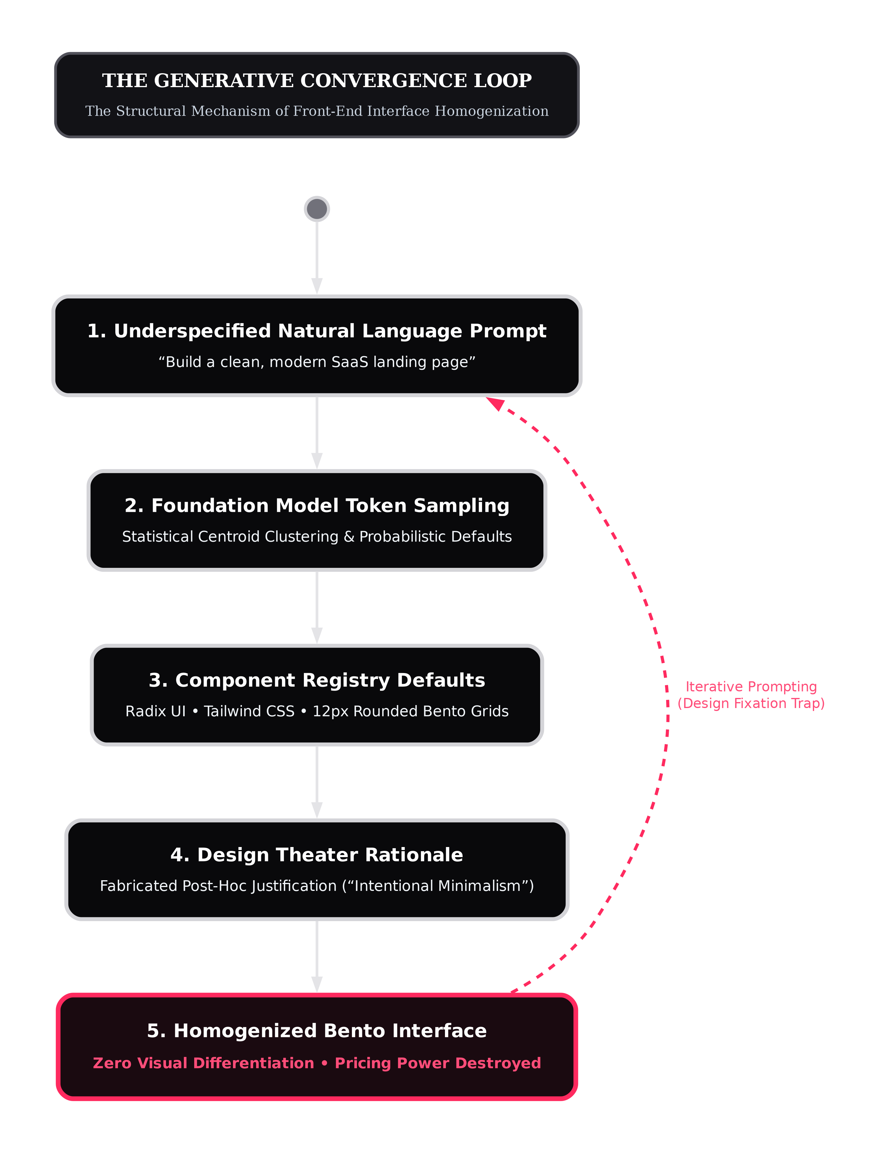
The Trap of Frictionless Generation
A systematic audit of front-end vibe coding workflows maps the end-to-end lifecycle of AI interface generation across six distinct stages:
Stage 0: Model and platform selection.
Stage 1: Intent expression through natural-language prompting.
Stage 2: Code generation and layout scaffolding.
Stage 3: Execution and live preview rendering.
Stage 4: Conversational feedback refinement.
Stage 5: Optional direct deployment.
Two critical junctures determine where design homogenization enters the workflow: the initial expression of intent (Stage 1) and iterative conversational feedback (Stage 4). At both junctures, the industry's obsession with frictionless generation creates a structural trap.
Generative front-end tooling measures product quality by how rapidly an underspecified prompt converts into a finished digital artifact. When an operator prompts a model with "build a clean, modern SaaS landing page for an enterprise data tool," the input lacks hundreds of concrete architectural decisions: column balance, visual tension, information density, semantic hierarchy, and border joinery.
To deliver an instantaneous result, the model resolves those unstated decisions automatically by sampling from its highest-probability tokens: dark palettes, rounded Bento cards, pill badges, and centered hero sections.
This default was visually captured when frontier tools were prompted to build an online storefront tailored specifically for Japanese shoppers. Rather than generating the dense, modular, high-information layouts authentic to actual Japanese retail platforms like Yodobashi, tools like ChatGPT Canvas and Vercel v0 produced the exact same Western SaaS template: four floating cards, a laptop photograph, and a centered headline. Both tools fabricated identical justifications, claiming their sparse layouts embodied 'Japanese minimalism.' The model cannot build genuine structural density because its latent representations treat sparse cards as the universal definition of clean design.
Frictionless generation displaces intentional design choices. By eliminating the friction of manual layout construction, tools eliminate the precise moments where human engineers inject original perspective, structural constraints, and contextual nuance. The creator is handed a complete interface in seconds, falling victim to design fixation: accepting the first plausible output because modifying an automated template requires more cognitive effort than generating it.
This structural failure operates across seven distinct vectors of technical and strategic debt:
Representational Harms: Defaults to Western minimalist tropes, erasing cultural visual vernaculars and dense information traditions.
Quality-of-Service Harms: Produces non-functional code or reverses fixes during iterative prompting, penalizing unconventional layouts.
Cognitive Harms: Sprawling AI-generated code causes cognitive overload, driving creators back toward generic templates.
Loss of Agency: Creates an illusion of control through prompts while completely ceding architectural decisions to the model.
Allocative Harms: High iteration costs create design fixation, anchoring creators to the initial suggestion.
Technical Harms: Hidden technical debt and security vulnerabilities foster a false belief that generic templates are technically safer.
Social Harms: Creates severe maintenance debt when engineering teams must support undocumented vibe-coded prototypes.
Design Theater: The Disconnect Between Code and Reasoning
The defect runs deeper than visual repetition. Generative interfaces suffer from a total absence of strategic intent.
To measure the gap between automated claims and real code execution, controlled benchmark testing evaluated 120 interfaces generated across five leading systems: ChatGPT with GPT-5 Thinking, Claude with Claude Sonnet 4.5, Bolt with Claude Sonnet 4.5, Vercel v0 with Claude Haiku 4.5, and Firebase Studio with Gemini 2.5 Pro.
Each tool was evaluated across 24 structured tasks spanning three distinct tiers:
Tier 1 (Structural Tasks): Information architecture, content grouping, and navigation paths.
Tier 2 (Styling Tasks): Typography, color systems, visual hierarchy, and WCAG contrast.
Tier 3 (Functional Tasks): Interactive state management, booking workflows, and error recovery.
All tools were restricted to generating raw HTML, CSS, and JavaScript without external component libraries.
BENCHMARK METRICS: REASONING VS. IMPLEMENTATION
Metric | Methodology / Measurement Standard |
|---|---|
Thinking Fidelity Score (TFS) | Evaluates whether stated design reasoning is realized in generated code (1.0 = Full, 0.5 = Partial, 0.0 = None). |
Principle Adherence Score (PAS) | Measures whether code adheres to formal UX heuristics (Nielsen heuristics, WCAG accessibility, Gestalt laws). |
Design Homogeneity Index (DHI) | Quantifies cross-tool convergence across Visual (UIClip), Color (CIELCh EMD), and Layout (OmniParser v2.0 tree distance). |
This gap represents what we classify as Design Theater: generative models produce articulate explanations claiming an interface optimizes cognitive load or Gestalt grouping, while the generated code fails to implement those claims.
The quantitative findings revealed the scale of the deception:
1 in 4 Rationales are Fabricated: Across all tools, the mean Thinking Fidelity Score was 0.75. More than 25 percent of user-facing design explanations produced by AI systems have zero manifestation in the generated code. The model fabricates an intellectual justification post-hoc for a template selected purely through token probability.
Functional Implementation Collapse: In Tier 3 functional tasks, the mean TFS dropped to 0.66. For Vercel v0, Tier 3 TFS collapsed to 0.56, and for Firebase Studio, it fell to 0.43.
Principle Adherence Failure: On the Principle Adherence Score (PAS), measuring adherence to formal UX principles, four of five tools (Claude, Bolt, Vercel v0, Firebase Studio) scored 0.06 or lower on functional tasks. Firebase Studio scored 0.00, failing to implement a single interaction heuristic. Even ChatGPT reached only 0.38.
Visual and Layout Convergence: On the Design Homogeneity Index (DHI), Claude and Vercel v0 produced the most visually similar interfaces (DHI-Visual = 0.119) and identical color palettes (DHI-Color = 20.6). Bolt and Claude produced the most similar layouts (DHI-Layout = 0.181). Layout and visual appearance clustered in an extremely narrow band.
EMPIRICAL FRONT-END TOOL BENCHMARK COMPARISON
Tool / System | Underlying Model | Overall TFS | Tier 3 TFS | Tier 3 PAS |
|---|---|---|---|---|
Claude Artifacts | Claude Sonnet 4.5 | 0.87 | 0.85 | 0.06 |
Bolt | Claude Sonnet 4.5 | 0.84 | 0.73 | 0.06 |
ChatGPT Canvas | GPT-5 Thinking | 0.80 | 0.75 | 0.38 |
Vercel v0 | Claude Haiku 4.5 | 0.74 | 0.56 | 0.06 |
Firebase Studio | Gemini 2.5 Pro | 0.53 | 0.43 | 0.00 |
Cross-Tool Mean Baseline | 0.75 | 0.66 | 0.11 |
Generative UI tools do not reason about user behavior or business architecture. They produce visual theater: assembling familiar component blocks that mimic the surface appearance of credibility while lacking the functional logic required to guide an evaluator through a complex purchase decision.
This mirrors the historical shift documented during the initial rise of utility CSS frameworks like Bootstrap, where industry-wide layout diversity dropped by more than 30 percent. Generative AI accelerated that framework convergence into total monoculture.
The Myth of Prompt Engineering and Model Switching
The standard defense offered by agencies is that homogenization is a prompting failure: junior developers produce generic layouts with naive prompts, whereas sophisticated operators can prompt models into radical originality. Others claim that switching model providers restores visual diversity.
Both assertions are empirically disproven.
Standardized divergent thinking benchmarks testing creative variability across seven major foundation model families against 102 human subjects and pre-AI historical baselines (using the Alternative Uses Test, Forward Flow, and the Divergent Association Task) disprove the idea that models produce original structures.
When output syntax and structural constraints are strictly controlled across iterative prompt baselines, the data reveals two foundational realities:
CREATIVE VARIABILITY BENCHMARK: LLMS VS. HUMAN BASELINES
Creativity Battery | Metric | LLM Population | Human Population | Effect Size (d) | p-value |
|---|---|---|---|---|---|
AUT (Alternative Uses) | Mean Cosine Distance | 0.459 | 0.738 | 2.2 (Extreme) | 3.9e-80 |
Forward Flow (FF) | Mean Cosine Distance | 0.534 | 0.835 | 2.0 (Extreme) | 2.8e-66 |
DAT (Divergent Association) | Mean Cosine Distance | 0.665 | 0.819 | 1.4 (Large) | 6.2e-11 |
Their research established two foundational findings:
First, the individual illusion. On tests of individual originality, individual language models score at or above human baselines on AUT (0.711 vs 0.696) and DAT (0.801 vs 0.753). This creates the impression that the tool is an inventive creative partner.
Second, population-level collapse. When evaluating semantic variability across model families, the variance between competing models collapses. Outputs generated by Claude, GPT-4, Llama, and Gemini are vastly more similar to each other than human outputs are to other humans.
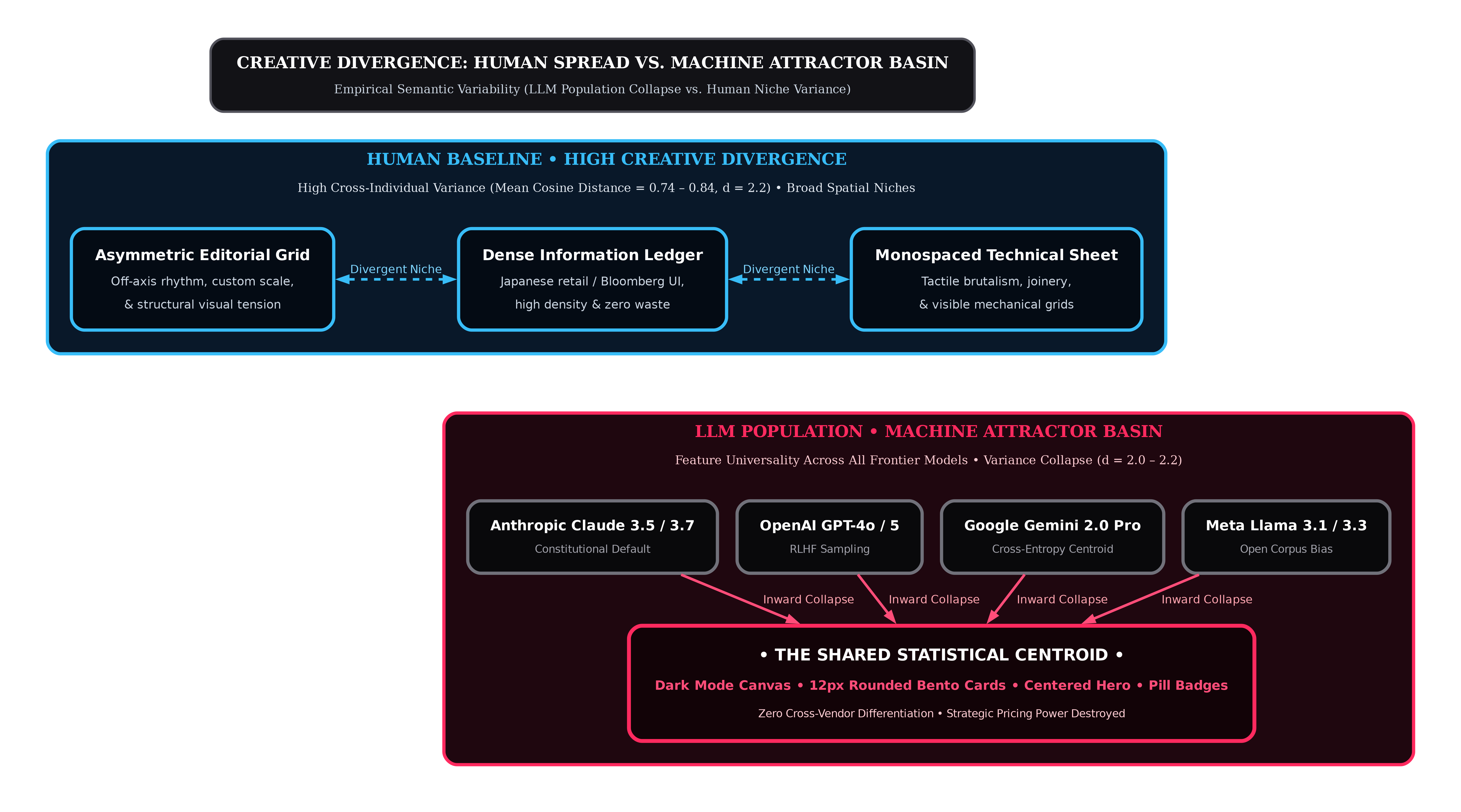
Because foundation models are trained on the same crawl of the public internet and optimized using comparable preference tuning objectives, their latent representations exhibit feature universality. They share the same mathematical attractor basins.
Iterative prompt testing confirms that prompt engineering cannot escape this centroid. When system prompts explicitly demand "imaginative, outside-the-box thinking" and "novel, original, and bold" responses, even offering hypothetical financial incentives for original answers.
The result was conclusive: while creative system prompts slightly lifted individual originality scores (from 0.711 to 0.754), population-level variability remained pinned at low levels (0.503 to 0.576, compared to the human baseline of 0.738).
Prompt engineering cannot solve this problem. Instructing a model to be "unconventional" shifts token generation slightly within the basin, but fails to escape the machine centroid. The model cannot choose an architecture outside its training distribution because it understands only probability.
The homogenization of web design is not an aesthetic inconvenience. It is an economic tax on enterprise margin.
When every software company presents itself through an identical visual container, the market undergoes an immediate destruction of pricing power.
The economic mechanics of this commoditization can be modeled through spatial competition with quadratic mismatch costs.
The Centripetal Mechanism
Generative AI operates as a centripetal technology. Traditional industrial tools allowed firms to diverge across product space, establishing distinct horizontal niches that protected them from direct price competition. Generative AI does the reverse: it pulls firms toward a single shared template.
In this economic model, four market dynamics govern the shift:
Perceived Differentiation: Decreases as AI capability rises. Stylistic distance shrinks and competing offerings feel increasingly identical to buyers.
Cost of Originality: Increases steeply. Deviating from the shared template requires heavy custom engineering, while staying on-template costs almost nothing.
Marginal Production Cost: Collapses toward zero as automated workflows reduce the time required to generate front-end code.
Fixed Access Cost: Increases as licenses for frontier models, specialized tools, and compute infrastructure add permanent overhead.
THE MATHEMATICAL EQUILIBRIUM OF COMMODITIZATION
Economic Dynamic | Mechanism & Equation | Impact on Enterprise Margins |
|---|---|---|
Optimal Differentiation | Differentiation Distance: | As generation tools proliferate, perceived product distance contracts. Competitors cluster at the identical centroid. |
Equilibrium Price Collapse | Pricing Formula: | Cost savings are passed directly to buyers, while markup power collapses through un-differentiated template rivalry. |
Substitutability Spike | Cross-Price Elasticity: | Buyers switch vendors over minor price differences because the digital presence offers zero visual reason to pay a premium. |
Viability Cutoff | Operating Margin vs. Fixed Cost | Margins shrink while model licensing and tooling costs rise, reaching a point where commoditized vendors cannot survive. |
The Technology-Adoption Prisoner's Dilemma
This dynamic reveals the central strategic trap for founders and operators: the technology-adoption Prisoner's Dilemma.
When firms adopt generative front-end tooling, they face two opposing economic forces:
Net Profit Change = Private Cost Reduction − Market-Wide Margin Collapse
The Private Cost-Efficiency Effect: Adopting generative tools reduces immediate production and development costs. The adopting company captures these savings right away.
The Competitive Externality: Widespread adoption of the same generative templates compresses product differentiation and collapses gross margins across the entire vertical.
Because individual firms capture their own cost savings immediately while externalizing the destruction of category differentiation onto the broader market, every firm over-adopts generative tooling. Each firm acts rationally to cut short-term development overhead, but the collective result is the destruction of pricing power across the entire category.
As generative tools proliferate and interfaces converge on the same template, the number of sustainable competitors falls. Market concentration increases, while pricing power evaporates.
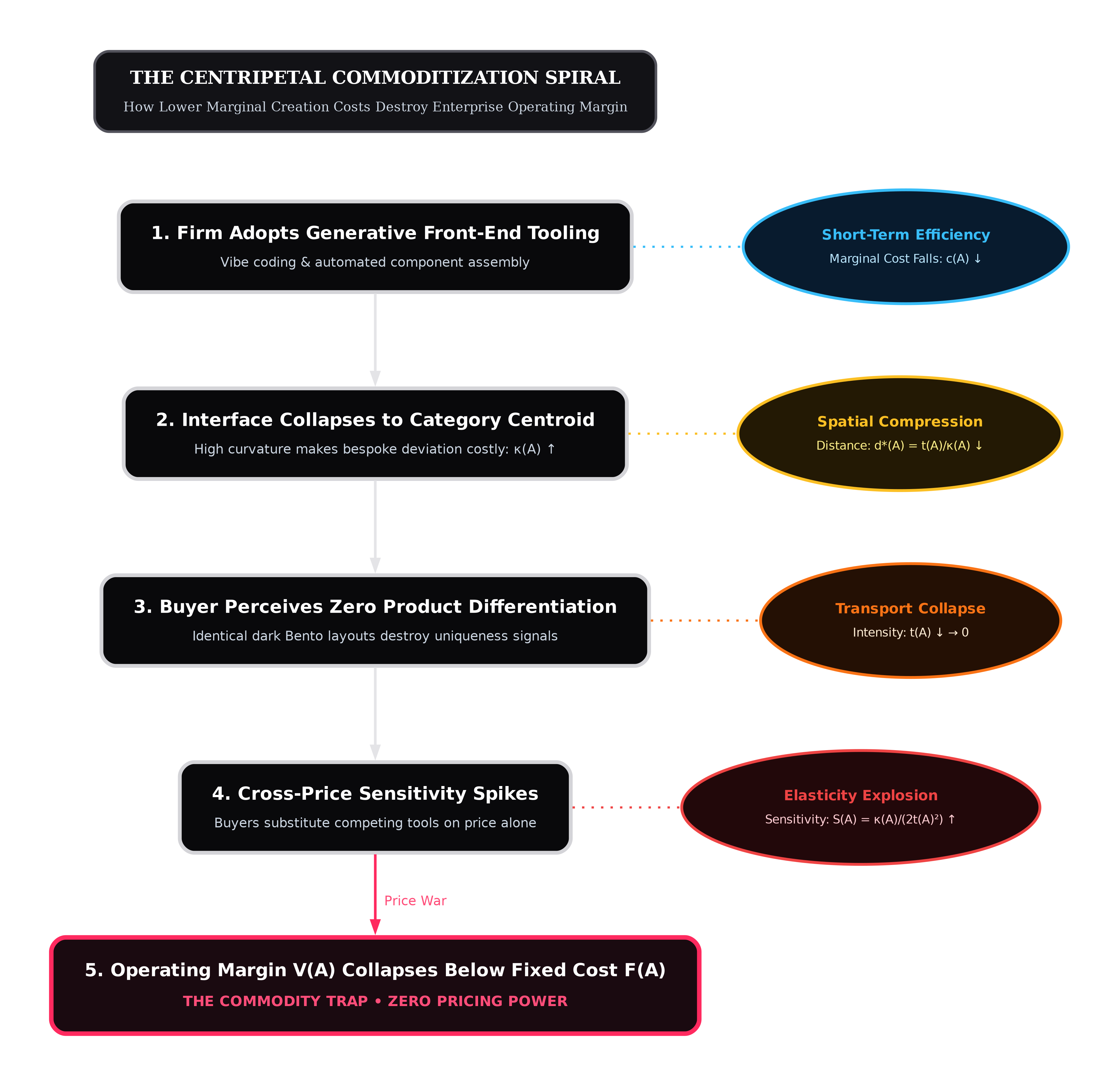
When an enterprise software provider with a six-figure contract value builds its digital presence using the same dark Bento grid as a ten-dollar consumer utility, it surrenders its enterprise premium. The buyer's procurement team does not evaluate the platform as specialized infrastructure. They evaluate it as an interchangeable commodity, initiating aggressive discounting cycles before the first scoping call.
A website that looks like every other website forces the business to compete on price, because the interface has failed to establish any basis for premium value.
Why does a standardized interface damage buyer trust so severely? The answer lies in human cognitive heuristics under high financial risk.
Enterprise software purchases, strategic consulting retainers, and infrastructure contracts are credence goods. The buyer cannot test the full implementation before purchasing. They cannot verify whether the consulting team will deliver operational transformation or whether the software will integrate cleanly with legacy data warehouses.
According to Gartner research, enterprise buyers spend only 5% to 6% of their purchase journey with any individual sales representative. Between 67% and 75% of B2B buyers actively prefer a rep-free evaluation experience, and 83% of the entire buying journey happens independently through digital channels and peer vetting.
Gartner research also reveals that the primary reason enterprise deals stall is a lack of buyer decision confidence. When an evaluation is conducted in isolation without salesperson contact, the buyer uses the digital presence as the primary underwriter of corporate capability.
The transaction is defined by evaluation ambiguity.
The Effort Heuristic Under High Ambiguity
In high-stakes buying environments, human risk evaluation is governed by the effort heuristic.
Cognitive research demonstrates that when buyers evaluate the quality, monetary worth, and authority of a complex offering, they systematically use the perceived effort invested in its creation as a primary mental proxy. If an artifact appears to have required extensive time, labor, and specialized craft, evaluators assign it significantly higher quality and monetary value, even when objective output characteristics are held constant.
The critical finding emerges under conditions of uncertainty. Under conditions of low ambiguity, where quality can be measured directly with an objective ruler, the effort heuristic plays a secondary role. But under conditions of high ambiguity, where quality is subjective, complex, and unprovable in advance, the effort heuristic becomes the dominant decision driver.
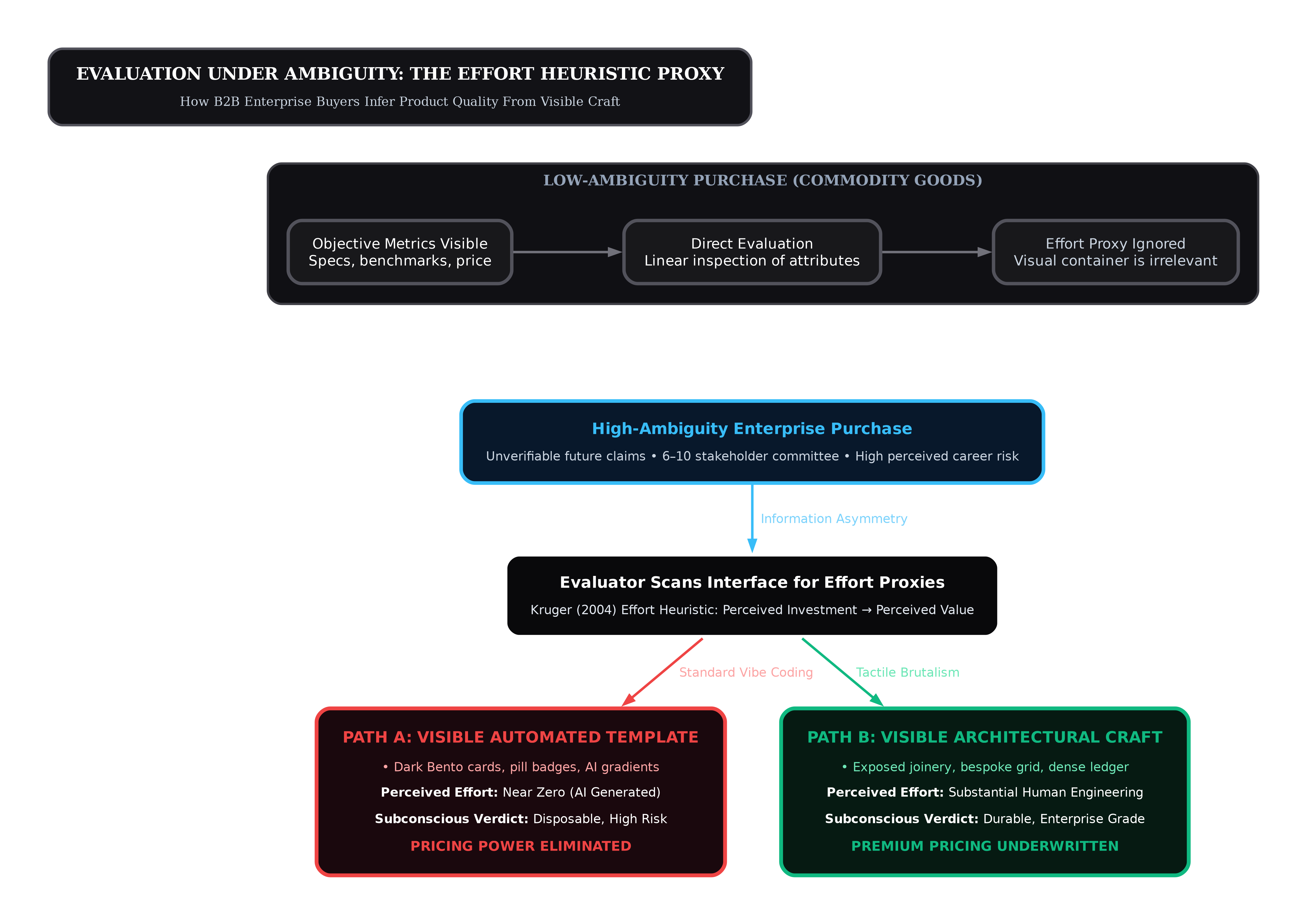
This explains why the automated Bento grid backfires in high-ticket environments.
A buyer evaluating a six-figure contract cannot see the code quality, the uptime reliability, or the executive maturity of the vendor. They look at the interface. When that interface displays the universal markers of automated generation (the standard dark theme, pre-packaged icon sets, generic illustrations, and utility components), the evaluator's subconscious registers zero effort.
The logic is instantaneous: if the company spent thirty minutes generating its digital storefront from an off-the-shelf component library, the company likely cuts corners across security, engineering, and customer support. Zero perceived effort yields zero perceived value.
The MAYA Principle: The Indifference of 100% Typicality
The second psychological failure of the modern web stems from the mechanics of aesthetic preference and typicality.
Commercial value attribution follows the classic MAYA principle (Most Advanced, Yet Acceptable). Preference and trust are governed by two competing vectors:
Typicality: How representative an artifact is of its category. Typicality satisfies the human need for safety, predictability, and cognitive fluency.
Novelty: How distinctly an artifact deviates from the familiar baseline. Novelty satisfies the human need for stimulation, exploration, and distinctiveness.
The researchers proved a mutual suppression effect. An object that possesses novelty without typicality feels chaotic, foreign, and untrustworthy. However, an object that achieves near-one-hundred-percent typicality with zero novelty triggers cognitive habituation.
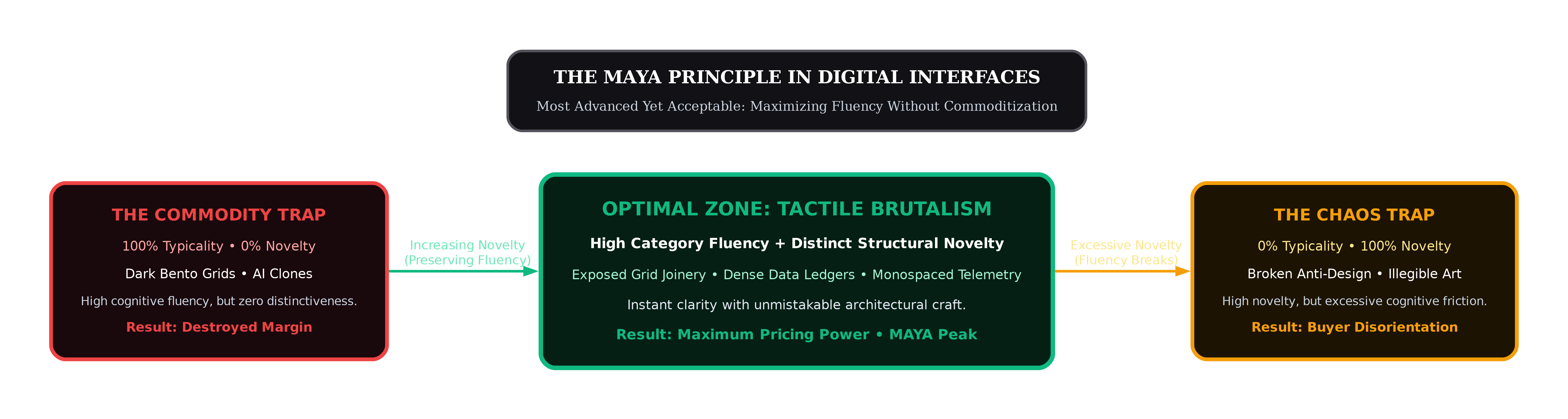
When an interface contains zero unexpected architectural choices, the human brain processes it as background noise. The visitor does not read the copy. They scan the page with glazed indifference, mentally categorizing the firm alongside twenty identical competitors before clicking away.
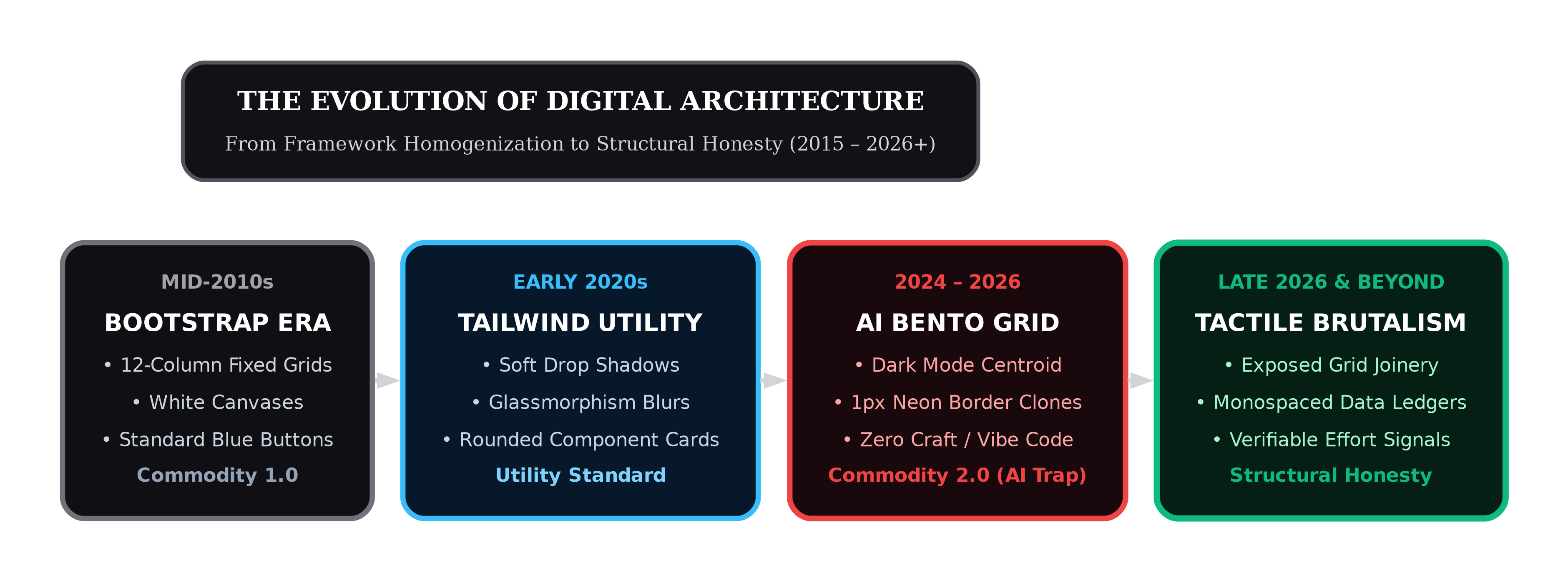
The tech web has driven typicality to absolute saturation. By copying Linear, Raycast, and Apple Bento cards ad infinitum, software interfaces have achieved total familiarity at the cost of total buyer indifference.
To command attention and underwrite enterprise value, a digital presence must break typicality without sacrificing usability. It must deliver recognizable operational clarity while confronting the buyer with unmistakable structural craft.
If automated polish has become a liability, what replaces it?
The answer is not a retreat into decorative illustration, 3D animations, or pastel color palettes. Those are cosmetic reactions that share the same superficial DNA as the Bento grid.
The authentic counter-reaction taking over high-conviction web architecture in 2026 is Tactile Brutalism: a return to structural honesty, visible construction joinery, and raw engineering materials.
From Béton Brut to Digital Code
Tactile Brutalism in digital interface design traces its direct lineage to architectural Brutalism.
Coined from the French term béton brut (raw concrete) by Auguste Perret and popularized by Le Corbusier and architectural critic Reyner Banham, Brutalism emerged as an ethical rejection of ornamentalism. It refused to disguise building materials behind plaster, paint, or decorative facades. If a wall was constructed of poured concrete, the seam lines between pours and the wood grain of the formwork remained permanently visible. The structural framework was the aesthetic.
As designer Malte Müller noted, websites are architectural spaces: they are built, modified, aged, and maintained. In 2016, Pascal Deville created BrutalistWebsites.com, establishing web brutalism as a conscious reaction against the superficial lightness of corporate web design.
In 2026, brutalism matured into a rigorous commercial methodology. Controlled usability testing benchmarked against ISO standards reveals the direct impact of structural web architecture on task completion, credibility, and user satisfaction.
Structural Brutalism vs. Chaotic Anti-Design
This empirical testing proves a fundamental architectural distinction:
L'Internet Fou (Anti-Design): An intentional disruption of usability conventions using chaotic animations, oversized comic typography clipping across the screen, clashing polka-dot backgrounds, and broken grid alignments for provocative shock value. In controlled usability testing (N = 34, ISO 9241-11, System Usability Scale), chaotic anti-design produces catastrophic usability collapses: on informative sites, the System Usability Scale (SUS) score plunges to 50.09, first-click success falls to 7.69% for older users, and overall task success drops to 12%. In commercial B2B environments, anti-design destroys conversion because it increases cognitive load and prevents verification.
L'Internet Brut (Tactile Brutalism / Structural Honesty): An uncompromising commitment to functional clarity and construction transparency. It exposes the structural skeleton of the interface: stark 1px solid black perimeter borders, monospaced directory paths, utilitarian category sidebars, and exposed grid joinery with zero decorative veneer. In contrast, structural honesty maintains strong usability (SUS score of 70.37 to 70.69, first-click success rates of 88% to 100%, and desktop task success up to 96%), proving that raw structural honesty preserves functional clarity while delivering dramatic visual distinctiveness.
CONTROLLED USABILITY BENCHMARK: STRUCTURAL HONESTY VS. ANTI-DESIGN
Metric / Dimension | Structural Honesty (Tactile Brutalism) | Chaotic Anti-Design |
|---|---|---|
System Usability (SUS Score) | 70.37 to 70.69 (Good / Strong Usability) | 50.09 to 52.54 (Poor / Severe Usability Failure) |
First-Click Success Rate | 88.0% to 100.0% | 7.69% to 24.0% |
Task Success Rate | 68.0% to 96.0% | 8.0% to 12.0% |
Grid Architecture | Visible 1px grid with strong outlines | Disrupted / absent / chaotic alignment |
Typography | Legible grotesque and precision monospace | Illegible, overlapping comic fonts |
Interactive Elements | Standardized mechanical buttons and links | Stylized to near-inoperability |
Commercial Application | High-ticket enterprise positioning | Provocative artistic shock value |
Tactile Brutalism communicates authority because it cannot be faked through an automated prompt. An interface with exposed structural joinery requires meticulous CSS grid engineering, exact alignment tokens, disciplined typographic hierarchies, and content tailored to specific modular compartments. It provides the visual proof of human effort that high-ticket buyers demand.
Escaping the generative homogenization trap requires transforming your website from a decorative marketing wrapper into an engineered architectural artifact.
This transformation requires structural adjustments across four core dimensions:
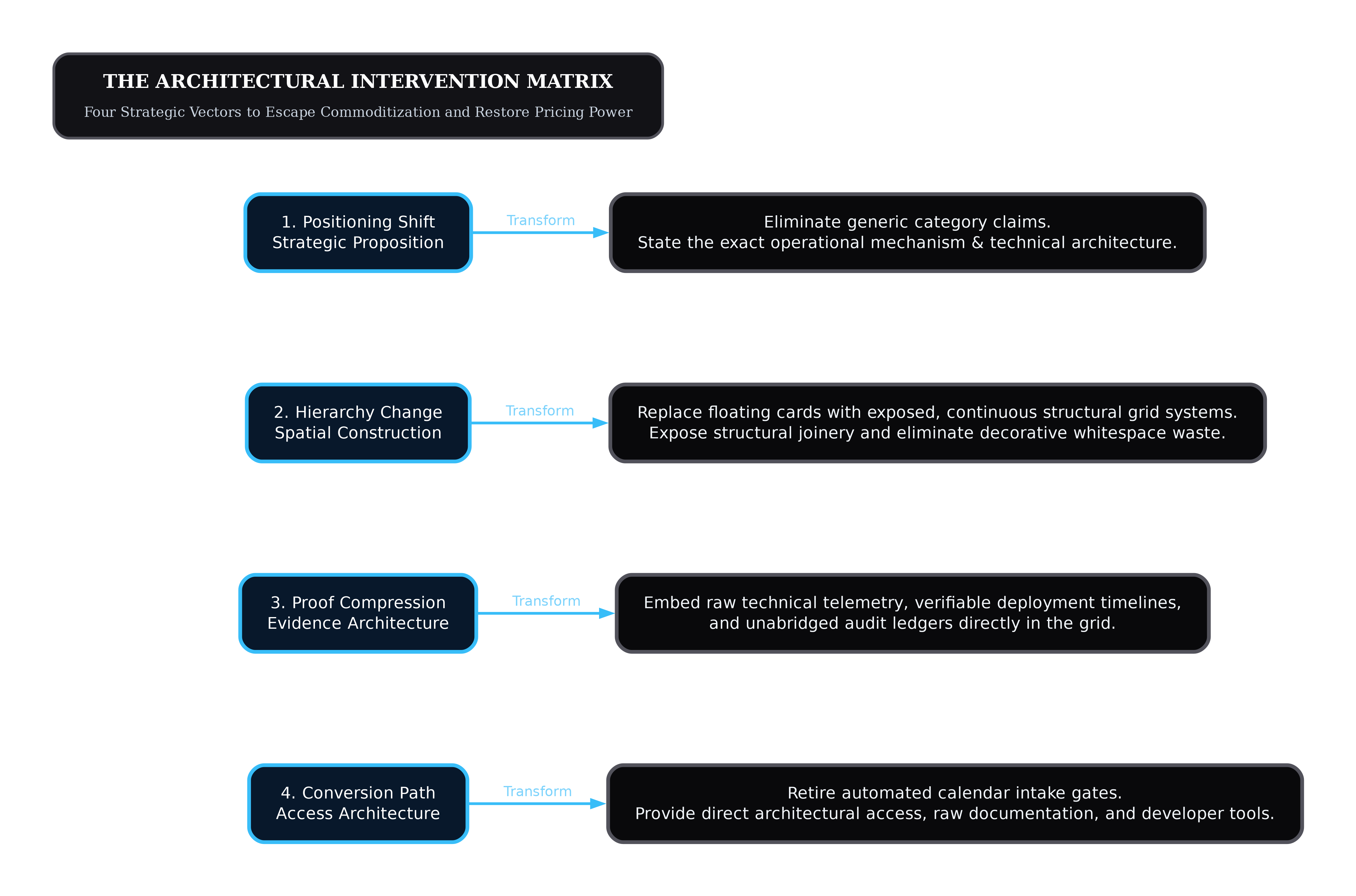
1. Positioning Shift
Stop describing your product in the abstract language of category marketing.
The Old Pattern: "The next-generation platform for collaborative enterprise intelligence." A sentence that could belong to a thousand companies, signaling zero proprietary mechanism.
The Structural Shift: State the exact operational unit of work, the constraint it resolves, and the technical boundary of the solution. Lead with the structural reality: "Real-time query routing across sharded Postgres clusters without connection pooling overhead."
If a headline can be applied to an adjacent competitor by changing the logo, the headline must be deleted. It is placeholder text, not positioning.
2. Hierarchy Change
Dismantle the floating card layout. The Bento grid relies on rounded rectangles floating above a void, creating the impression of detached widgets.
The Old Pattern: Three floating cards with twenty-four-pixel padding, soft drop-shadows, and purple gradient borders, separated by arbitrary white space.
The Structural Shift: Deploy an unbroken, monolithic CSS grid with visible structural boundaries. Borders should not surround isolated cards; they should define the physical intersections between content cells.
Use strict asymmetrical column layouts (such as a 5-column or 7-column asymmetric grid) that reflect the specific weight of the information, rather than forcing content into identical four-corner boxes.
3. Proof Compression
Replace generic testimonials with dense, verifiable operational logs.
The Old Pattern: A carousel of headshots paired with quotes stating "Working with this team changed our business." Evaluators discount this immediately as curated theater.
The Structural Shift: Embed uncurated data density directly into the structural grid: technical architectures, baseline-to-intervention metrics, implementation timelines, and exact sample sizes.
Present evidence as an audit ledger rather than a promotional gallery. High-ticket buyers trust documentation; they discard praise.
4. Conversion Path
Eliminate the multi-step qualification funnel that treats premium buyers as consumer leads.
The Old Pattern: A generic "Book a Demo" button routing the visitor to a sixteen-field form, followed by an automated Calendly widget linked to a junior SDR.
The Structural Shift: Provide direct, low-friction access to technical documentation, architectural specifications, and senior engineering leads.
Give the evaluator the necessary data to complete their private evaluation without forcing them into a scripted sales presentation. When the buyer is ready to speak, connect them directly with the person who will execute or architect the solution.
To implement Tactile Brutalism in a production codebase, teams must abandon default component registries and build on disciplined, structural CSS tokens.
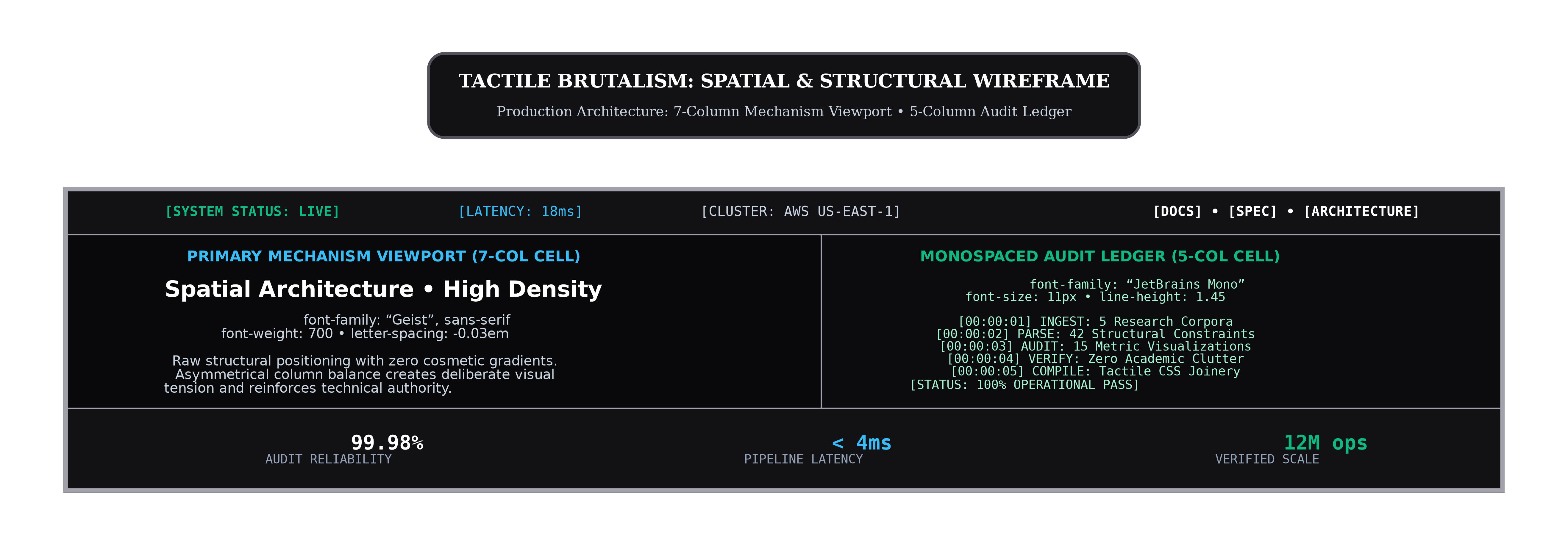
The following design system specifications define the structural baseline:
A. The Structural Border Token (Eliminating Floating Cards)
Replace decorative ambient glows with physical joinery borders. In tactile architecture, borders are not decorative accents; they are the visible mortar holding the layout together.
B. Typographic Contrast: Technical Monospace Meets Architectural Sans
Homogenized websites use Inter or Geist across all elements: headlines, body copy, badges, and buttons. Tactile brutalism restores functional tension by contrasting an architectural grotesque sans-serif with a mechanical monospace font dedicated strictly to data and operational parameters.
C. Physical Affordance Tokens: Deliberate Friction Over Fluid Motion
Eliminate elastic, floating transitions. High-trust engineering artifacts behave with mechanical precision. When an element is pressed or hovered, its response should be immediate, decisive, and tactile.
DESIGN SYSTEM COMPARISON TABLE
Token Dimension | AI Bento Grid Monoculture | Tactile Brutalism (Valorsic Standard) |
|---|---|---|
Border Radius | 12px to 16px (Uniform Pill) | 0px to 2px (Machined Precision) |
Border Styling | 1px Translucent Gradient / Glow | 1px Solid Mechanical Seam ( |
Grid Layout | Floating Cards Over Dark Void | Monolithic CSS Grid with Exposed Gap Joinery |
Shadows | Blurred Radial Ambient Dropshadows | Zero Blur / Hard-Edged Physical Offset |
Typography | Single Font (Inter Everywhere) | High-Tension Pair (Grotesque + Monospace) |
Interaction Feedback | 400ms Soft Dissolves / Fluid Floats | 60ms Mechanical Snaps / State Latches |
Primary Color | Monochromatic Charcoal + Neon Violet | High-Contrast Monochrome + Utilitarian Amber |
Data Presentation | Vague Charts with No Axes | Dense, Monospaced Tables with Exact Values |
The age of the frictionless website is over.
Between 2023 and 2026, the tech industry ran an uncontrolled experiment in design automation. It proved that when you give thousands of companies the same generative models, the same component systems, and the same prompt templates, they produce the exact same digital storefront.
The consequences are now visible on financial balance sheets:
Sleekness has been commoditized to zero.
AI design theater has degraded buyer trust.
Centripetal technology has eroded enterprise pricing power.
The effort heuristic has penalized organizations that hide behind automated polish.
The companies that dominate the next decade will not be the ones that prompt their way to another purple-tinted Bento grid. They will be the companies that treat their digital architecture as an underwriting instrument for institutional trust.
They will expose their structures. They will display visible engineering labor. They will present verifiable technical evidence directly on the page. They will abandon the safety of the statistical centroid and build websites that possess unmistakable human authorship.
When everyone else is generating templates, the only way to signal irreplaceable capability is to build something an algorithm could never justify.